
CHOCOLATE IS CHOCOLATE, BUT NOT ITS PACKAGING
the beauty of branding
Jiyoung Park
 |
| Chocolate is Chocolate, kind of |
Even though people say, “Don’t judge a book by its cover,” the first thing we look at when we go to buy chocolate is the packaging. One could say that chocolate is chocolate, and so how it is packaged is the game changer. The package decides the market, the price, even the taste of what is essentially the same product in different guises. As an artist and consumer, I appreciate the effort and talent that companies devote to this fattening and tasty product.
Saint Choco certainly has an eye-catching style. The designer Goze Ekim combines traditional tarot symbols with a contemporary design percept. Saint Choco is a Turkish company and they’re selling to a diverse and conflicted market (political life in Turkey is quite complex). One might say that their goal is to make children smile and adults feel like kids. The company wants to remind their customers that regardless of religion, language, or race, they are all human beings who love chocolate. The tarot card inspired design hints at religion without really invoking it. In a country that’s in the midst of great religious conflict, you don’t want your product to be part of the civil war: you want the whole market, the religious and non-religious alike. Eating Saint Choco chocolate becomes a fun card game, and it makes it easier for people to approach the product.
 |
| The Saint of Chocolate |
Saint Choco has many different package designs for their different flavors. They use geometric shapes and fine lines to unite the brand. It has a very modern and delicate feel. They also use complementary primary and secondary colors to create a harmonious feel. The word, ‘Saint’ has a different meaning in Turkey. In English, we think of Saints as being highly elevated and holy people. However, in Turkish culture and religion, saint means friends of God. The word ‘friend’ has a more personal quality than what saint means in English. So Saint Choco approaches its customers as a friend without any overtones of religious conflict.
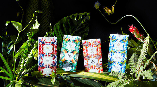
Harper Macaw chocolate is a Brazilian company whose aim is to capture the essence of the Brazilian rainforest. Their logo is a tribal mask. The name, Harper Macaw, represents the Harpy Eagle and Blue Hyacinth Macaw, two endangered species indigenous to Brazil’s rainforests. The design uses symmetrical shapes and patterns of rainforest creatures, evoking a sense of harmony with the natural world. Symmetry in design often means balance, and balance is what we associate with beauty, nature, and now great tasting chocolate.
 |
| Such a natural chocolate |
This brand not only succeeded in coming up with visually attractive packaging, but also in delivering a strong ecological message that their customers embrace. The flat and colorful illustrations on each box are a clean and simple design strategy. Eat Harper Macaw chocolate and become one with the world, or at least that’s the idea.
Carpe Koko is a high-end chocolate brand that comes in a box. Boxes are more exciting and intimate than wrappers. Boxes connote gifts; wrappers connote snacks. When I look at the box, I can’t tell if it’s a box of chocolate or fancy jewelry. Of course, that’s what the Carpe Koko designers want you to feel. Each drawer has a small grip that makes it easy to explore, as if you were filing through your most treasured items. The price range is from $9 to $144, so customers have a variety of choices and range from students to millionaires. You can choose how many pieces you want, and the chocolate will be placed in a gold box just for you.
 |
| This is classy |
Carpe Koko is the perfect gift for special occasions. Their design is inspired by Art Deco and hints at luxury, glamour, exuberance, and faith in social and technological progress. The packaging consists of black and gold colors, which add to the feeling of luxury. They have six different flavors: Darling Almond, Coffee Confession, Passion De La Fruit, Raspberry Reaction, Orange Trance, and Salted Caramel. In a basic sense what you are purchasing is a sense of the unique.
There’s nothing more exciting than getting a new set of paint tubes, but being able to eat a new set of chocolate paint tubes comes close. The Japanese designer Nendo thought brining childhood creativity and chocolate together was a good idea and I can’t disagree. The chocolate tubes are pretty and filled with molten crèmes and caramels. When I first saw them, I was already overwhelmed by the realistic look and then I was overwhelmed again with the variety of the selection.
 |
| Incredibly artistic and tasty |
Each tube has its own wrapper that states its flavor, and the color of the flavor. That’s a beautifully conceived design concept. Nendo is not a chocolatier. He is a well-known industrial designer who is inspired by small ‘!’ moments in his life. He has had his private exhibitions since 2003 and has received dozens of awards. Even though he was born in Canada, his works has a Japanese sensibility, which is minimalistic, simple, and clean. It consists mostly of thin lines and white spaces. This “too pretty to eat” dessert is absolutely tempting.
The last form of chocolate packaging I want to look at is 12 Days of Chocolate: A Designer Collection. This is a humorous riff on the "12 Days of Christmas." Every year, Chase Design Group creates a holiday gift to share with their clients. In 2013, they thought of an idea of doing a specially designed chocolate set. Each wrapper has a different design designed by a different artist, numbered one to twelve. The idea is to connect with clients by sharing their difficulties and hardships. Unfortunately they are not for sale, but it’s one of the most brilliant and beautiful ways to package chocolate I’ve ever seen.Packaging doesn’t control what’s inside pretty wrapper. It doesn’t change the essence of the chocolate, but it changes its purpose and meaning.
©Jiyoung Park and the CCA Arts Review
No comments:
Post a Comment