
CALLIGRAPHY IS DEEP IN THE SOUL OF CHINESE CULTURE
a history of an ancient art
By Leo Yang
 |
| Hans dynasty style, cursive script |
Calligraphy is an art that dates back to the early days of China and is integral to Chinese culture. You can’t understand the Chinese language without understanding Calligraphy, the way its beauty informs the way we communicate. In essence, it is an abstract art, very much like impressionism or cubism. But it is also a kind of traditional Chinese arts and crafts and the Chinese people have been using the brush pen to incredible effect for thousands of years. So one thing we know, the Chinese written language is not just a form of communication, but also a high art and an everyday craft that millions of people practice.
The origin of Chinese characters goes back thousands of years. No one knows how it started, but by now writing “characters” has become a kind of aesthetic practice that seeks to integrate the writer’s ideas, thinking, and spirit onto the page. In this way, it is uniquely different from the Western alphabet, which is primarily a form of transcription. So when we look at Calligraphy, we are in some sense feeling the whole of the person. For me, this is a beautiful way of expressing oneself and it’s not surprising that other countries — Japan, South Korea, Taiwan, Vietnam — have taken up some version of this practice. In fact, one of the most powerful inventors of the 20th century, Apple founder Steve Jobs said that Calligraphy changed how he thought about design and the world.
 |
| Calligraphy inspired Steve Jobs |
China's history is a diachronic and linear process, and calligraphy follows that same complex path. Chinese characters can be traced back to 4000 BC. There are several main categories of Chinese traditional calligraphy, such as Xingshu (semi-cursive), Cao (cursive) which started during the Han Dynasty. Zhuan (seal) standardized some of the shapes in China around 221 BC. Li (clerical) developed out of Zuan, leading to Kai (regular), the most commonly used style of Chinese calligraphy, and often regarded as the official style. The following represents some of the most interesting and important moments in the calligraphic tradition.
Oracle Script
Oracle script, the inscription on oracle bones, is the most ancient example of calligraphic arts that we have. Oracle script is composed of many straight lines, including the more difficult curves. The thickness of the strokes are mostly uniform. Lines are slightly fatter in the middle and thinner at both ends. Oracle looks thin and solid, upright and refreshing, and full of three-dimensional shapes. As for the structure of the word, the shape of the oracle bone inscriptions are mostly rectangular. In addition, the oracle bone inscriptions have a combination of square forms. Some words also have traces of pictograph characters.
 |
| The ground zero of calligraphy |
What’s fascinating about Oracle script is that it contains the basic elements of calligraphic art—the thin handwriting is the result of the type of knife the engravers used. They would write “yes” and “no” on opposite sides of the tortoise shell, which made these calligraphists before-the-fact highly attuned to symmetry and harmony, qualities that would become central to calligraphy and Chinese culture.
Later, inscriptions on bones developed into Jinwen and Da Zhuan. With the development of Jinwen (Bronzeware script) and Da Zhuan (Large Seal Script), “cursive" signs became more complex and ornate. Moreover, each archaic kingdom of current China had its own set of characters. Da Zhuan developed in the late Western Zhou Dynasty. It has two characteristics: First, the uneven thickness of the early lines have become even and soft, while the line drawn with the object is concise and vivid. Second, the writing is less haphazard, more structured and is laying the foundation for the word block.
 |
| Calligraphy becomes more uniform |
In Imperial China these characteristics become even more pronounced. The markings in these old styles, some dating from 200 BC, and in Xiao Zhuan style, are still accessible. After Qin Shi Huang unified China (221 BC), the policy of unifying weights and measures was led by Prime Minister Li Si. He changed the original kind of crooked stroke lines, sorting out a new font with even strokes. He simplified the original Da Zhuan used in Qin, canceled other six-nation languages, and created a written form of Chinese characters with uniform characters, Xiao Zhuan.
With the development of Chinese characters, Xiao Zhuan gradually began to have a definite shape, including the outline, stroke, structure of contemporary calligraphy. The pictorial charm in Chinese characters begins to weaken, which makes the text more symbolic and closer to art. It reduces confusion and difficulty in writing and reading. This is also the product of the first large-scale standardization of written language in our history. Xiao Zhuan font is slightly longer and neat, and its stroke is round and uniform.
As calligraphy standardized, fonts took on wide, flat shapes, long horizontal and short vertical strokes painting. Due to its high legibility to modern readers, it is still used for artistic flavor in a variety of functional applications such as headlines, signboards, and advertisements. This legibility stems from the highly rectilinear structure, a feature shared with modern regular script (kaishu). In structure and rectilinearity, it is generally similar to the modern script; however, in contrast with the tall to square modern script, it tends to be square and wide, and often has a pronounced, wavelike flaring of isolated major strokes, especially a dominant rightward or downward diagonal stroke.
 |
| Xiao Zhuan |
Kaishu (Regular script) gradually evolved from the official script and took on more simplified, horizontal and vertical lines. It is also known as "uniform script" and "real script," referring to the fonts of the order. It turned the "script head and goose tail" of the script into a flat and straight form. The word changed from plain to normal. Regular script began to germinate in the late Han Dynasty, developed during the period of Wei, Jin, Northern and Southern Dynasties, and reached its heyday in the Tang Dynasty. This script is still in use today, and is a basic skill people must learn in calligraphy.
 |
| Kai Shu |
The Xingshu (the semi-cursive or running script) was born in the late Eastern Han Dynasty and developed what we might call running script. Its most obvious innovation is that it can be used to finish a character in one stroke. Some strokes can be omitted or simplified. More importantly, running scripts have a direct connection to handwriting style. The script was born in the Han Dynasty, and impelented in the Wei and Jin Dynasties, has been popular ever since.
 |
| Xin Shu |
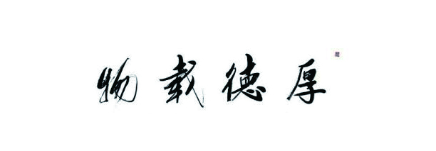
Caoshu (cursive script) is a Han dynasty style. Because writing speed, layout, and structure are not prescribed, it, like cursive, has greater flow. Today, the aesthetic value of this natural style is beyond its practical value. Cursive is a straightforward expression of the calligrapher’s response and emotions at the time of creation of the work.
 |
| Caoshu |
The illustration below shows the different calligraphy to Chinese character "horses". From this picture, we can see the process of the evolution of Chinese calligraphy. From the beginning of the pictograph to symbolization. Oracle script and bronze script are based on the shape of the horse. They looks very much like a horse's shape. Later the script standardized expressions Chinese characters, Chinese characters look like a contract sign and not a pictographic one.
 |
| Many versions of horses |
Different calligraphy of Chinese characters horse. Because calligraphy is a form of writing, calligraphic work must be in script form and easier to read for those who are familiar with the scripting style, although this may be illegible for those unfamiliar with scripting style. Many people can not read cursive writing, but cursive calligraphy can still be considered good if they are readable by cursors.
Chinese calligraphy serves the purpose of conveying ideas, but also displays the "abstract" beauty of lines. Rhythm, lines and structure are more precise in calligraphy than in painting or sculpture. Each Chinese character is built in its own square with a different structure and composition. Only three basic forms are drawn: circles, triangles and squares. There is a certain number of strokes for each character, named according to the whole body. To decorate the effect, you can not add or delete strokes. The appreciation of traditional calligraphic art brings readers aesthetic enjoyment, showing the personal taste of calligraphers, self-education and self-cultivation.
©Leo Yang and the CCA Arts Review
No comments:
Post a Comment